

Overview
Miva Open University started with a third-party student information system(SIS). For a while, it did the job. Then we grew.
More students meant more payments, more academic records, more edge cases, and more teams depending on the same data. The cracks became harder to ignore. We were paying a recurring licence for a system that increasingly required workarounds just to fit how the university actually operated.
The problem wasn't one broken feature. It was the amount of manual work happening around the system to keep everything running.
Payments were the first major pain point.
Students could pay through different channels: payment links, the legacy SIS, or direct bank transfers. None of them shared a single view of the truth. Finance relied on spreadsheets to reconcile transactions, confirm what each student had paid, and then update the SIS before enrolment could be released. A student could have completed payment and still be waiting because the systems hadn't caught up.
Student records had the same problem.
The SIS didn't properly connect to our LMS, finance system, or examination tools. So teams filled the gaps with spreadsheets, manual updates, and custom pipelines. It worked, but only because people were constantly keeping the systems in sync. Mismatched records and stale data became part of everyday operations.
Then there were the cases the system simply wasn't designed for.
Students defer. They resume. They carry incomplete courses into another semester. Their academic journey doesn't always follow a perfect sequence. Those states were fragmented across different tools, making it difficult to track progress, maintain fee parity, and answer what should have been simple questions about a student's status.
There was also a more fundamental issue: the payment model itself.
A traditional fee schedule assumes students pay predictable amounts at predictable times. That isn't always how tuition works for our students. Many are self-funded or working professionals, and income can be irregular.
So the challenge wasn't simply to replace an expensive third-party SIS.
We needed to build a system that could become the operational source of truth for the university, connecting payments, enrolment, academic records and student progression, while still accommodating the messy reality of how students actually pay and move through their studies.
That meant designing for flexibility without creating another system held together by exceptions.
Role, team, timeline
My role: Product design, UX architecture, UX writing, product strategy.
As Head of Product and Design, I led the design direction across the SIS and worked hands-on on the most critical operational flows, including payments, enrolment, and end-to-end administrative record management. Two product designers on my team owned the remaining student journeys, with me providing direction, reviewing their work, and ensuring the experience stayed consistent across the platform.
Team: me, 1 product manager, 2 product designers, 4 backend engineers, 4 frontend engineers, 2 QA engineers.
Timeline: 8 months to MVP, ongoing since.

Defining the MVP
We knew what the system needed to be eventually. Admission through to graduation, every payment, every record, every academic state in one place. We also knew we couldn't wait years to get there.
The university was already running. Students were enrolling, paying, sitting exams. Whatever we built had to carry the day-to-day from the moment it launched, without breaking anything that was already working.
So we started from a smaller question. What does the university actually need to function, every day?
Three answers came out of that.
Automate the repetitive work
Give students a clear view of where they stand
And lay a foundation the rest could be built onto later.
That gave us eight things to ship. Admissions and enrolment end to end, covering 100 level, direct entry and credit transfer intakes. Tuition payment and reconciliation, full and instalment, in Naira and Dollars. A unified student profile pulling academic, financial and personal data into one place. Course registration and results, so students could register and then see grades, GPA and CGPA without leaving. An admin dashboard covering admissions, enrolment and finance at a glance. University management for programmes, courses, ATPs, intakes and financial products. Integration with the LMS and exam portal behind a single login. And user management, for roles and permissions across every admin operation.
Why did we focus on these?
Nothing got on that list by being interesting. By solving the most painful, high-frequency problems first (like enrolment friction, payment visibility, and admin reconciliation) we could quickly validate the system’s reliability while keeping academic operations running smoothly. Every feature had to pass at least one of three tests.
Mission critical — the university cannot function without it.
High impact — it removes a daily pain for students or admins.
Scalable — it lays groundwork for what comes next.
The logic was stability before ambition. Solve the highest-frequency pain first, prove the system holds, keep academic operations running underneath.
Not everything made it.
For example Scholarship management was high impact. It wasn't mission critical. Finance could keep running it on a spreadsheet for another semester, and nobody would be blocked. So it waited.
The Student Journey
Miva's old system was built around a straight line. Apply, get admitted, pay, enrol, register for courses, learn, sit exams, get results, progress, graduate. For students who followed it, it mostly worked.
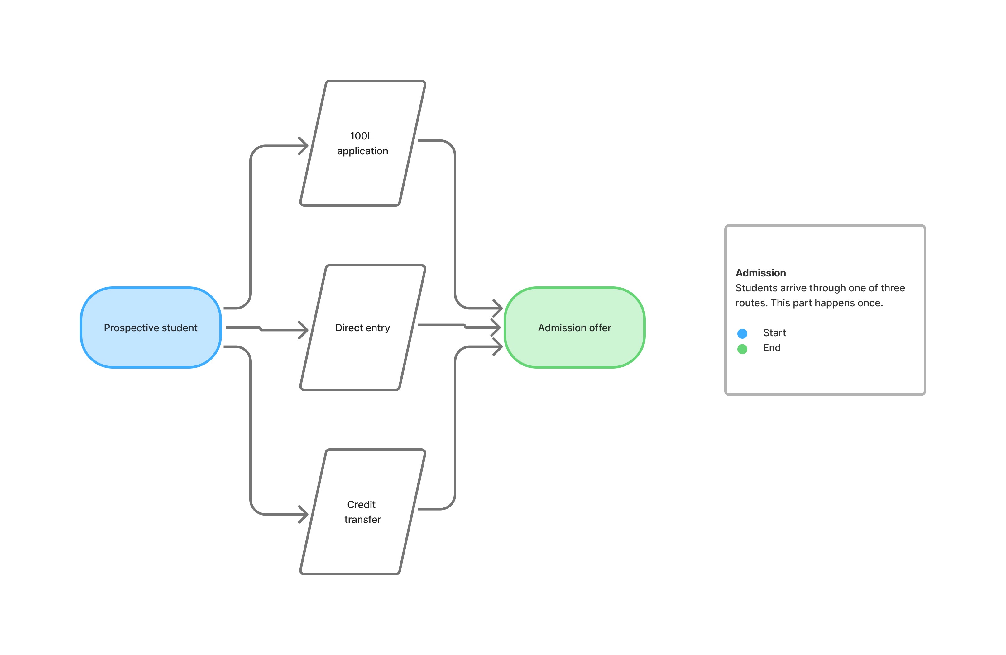
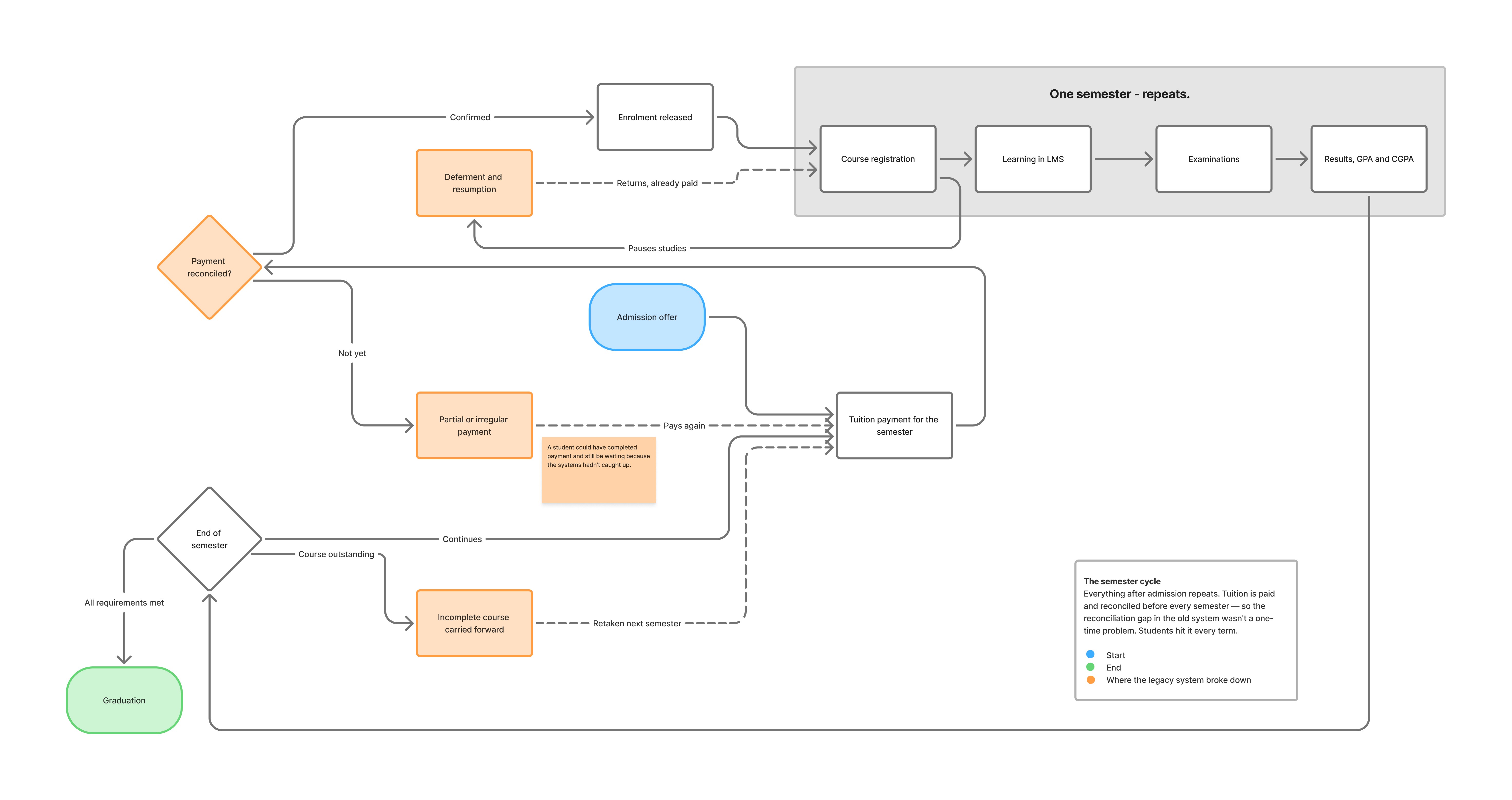
Looking at the journey properly, it splits into two parts that behave very differently. Admission happens once. A student arrives through a 100 level application, direct entry, or a credit transfer, and receives an offer. Everything after that repeats. Tuition is paid and reconciled, enrolment is released, courses are registered, the semester runs, results come out, and the whole thing starts again.
Because payment and reconciliation sit at the front of every semester rather than at the start of a degree, the reconciliation gap in the old system wasn't an onboarding problem that a student got past once. It was a gate they passed through every term, and every term there was a window where they had paid and the systems hadn't caught up.
The branches are where the line really breaks down. A student can defer partway through a semester, and when they return they don't pay again. The payment they already made applies to a semester they haven't taken yet. A student can also finish a semester carrying an incomplete course, which isn't resolved on its own but carried into the next semester and cleared when they register and pay for it. Neither of those is unusual. Both were held across different tools in the old setup, which is why answering a simple question about where a student was, what they owed and what they were cleared to do often meant opening three systems and a spreadsheet.
That shaped how we built the new one. A student's record couldn't be a position on a track. It had to be a state: what they've completed, what's outstanding, what they've paid, what they're cleared for, in whatever order those things happened. It also meant money and enrolment had to stop being the same record, because a deferred student's payment has to survive independently of the semester it was made for. Deferments and progression became their own module rather than a flag on an enrolment record, and the student profile was built to answer the status question in one view instead of assembling it from four.
The two diagrams below show this. The first is admission, which happens once. The second is the semester cycle, which repeats, with the branches real students actually take.
Designing for density and permission
The hardest screen was the unified student profile.
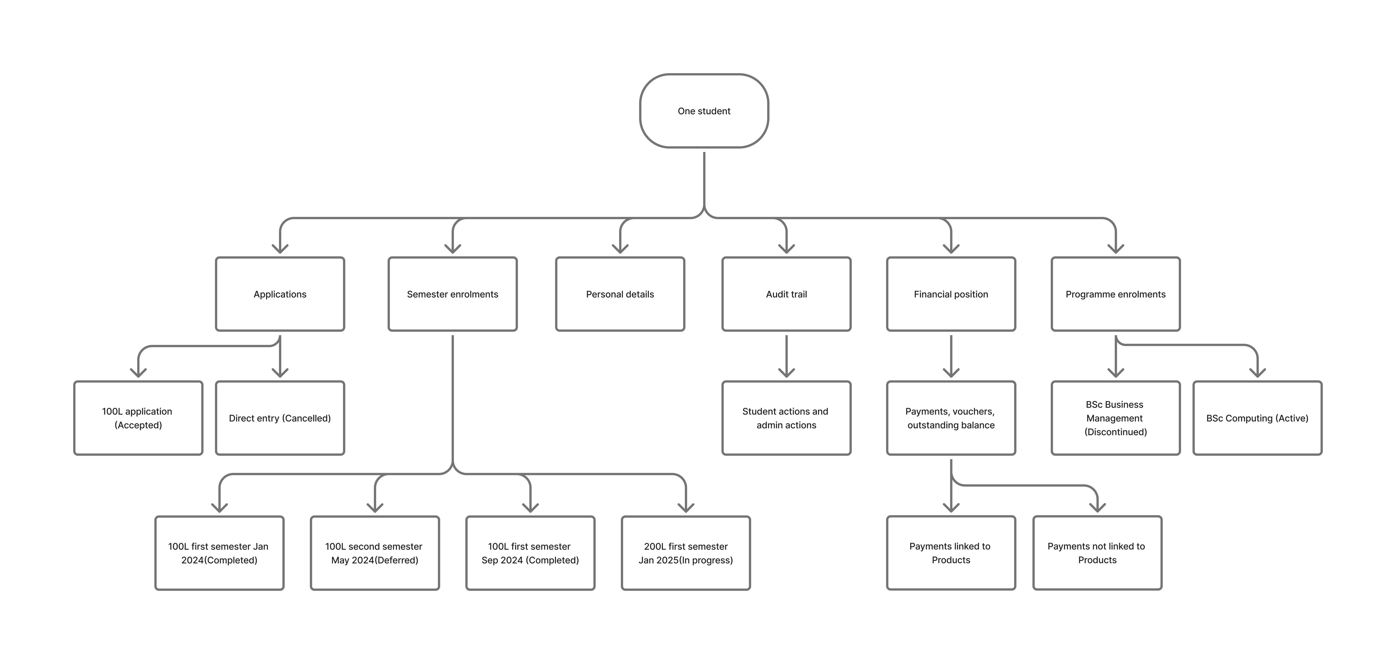
It had to hold personal details, every application a student had made and the status of each, every programme they were enrolled on, the semester by semester enrolment breakdown, their full financial position, the audit trail, and the basics an admin needs at a glance like student ID, programme, credits and amount due. The volume wasn't the problem. The problem was that almost none of it is singular. A student can have more than one application and more than one programme enrolment, so the screen had to hold sets of things rather than fields.
We tried three approaches before landing on one.
The first was a single long page with everything on it. Honest to the data, unusable in practice. The parts an admin needed constantly were buried among the parts they needed twice a year, and we didn't take it far.
The second put every section in a list beside a content pane. It looked orderly, but it moved the tuition summary out of the persistent area and into the enrolment content, so a student's financial position stopped being something you could always see. The section list also had no way of showing you where you were. Six sections, six identical rows, and nothing indicating which one the pane was currently displaying.
The third used accordions, with the student's key details in a card at the top. That card was right, and it survived into what we shipped. The accordions did not. Opening one section pushed everything below it off the screen, the sections you weren't in collapsed into a row of thin bars, and comparing two sections against each other meant closing one to open the other. What work
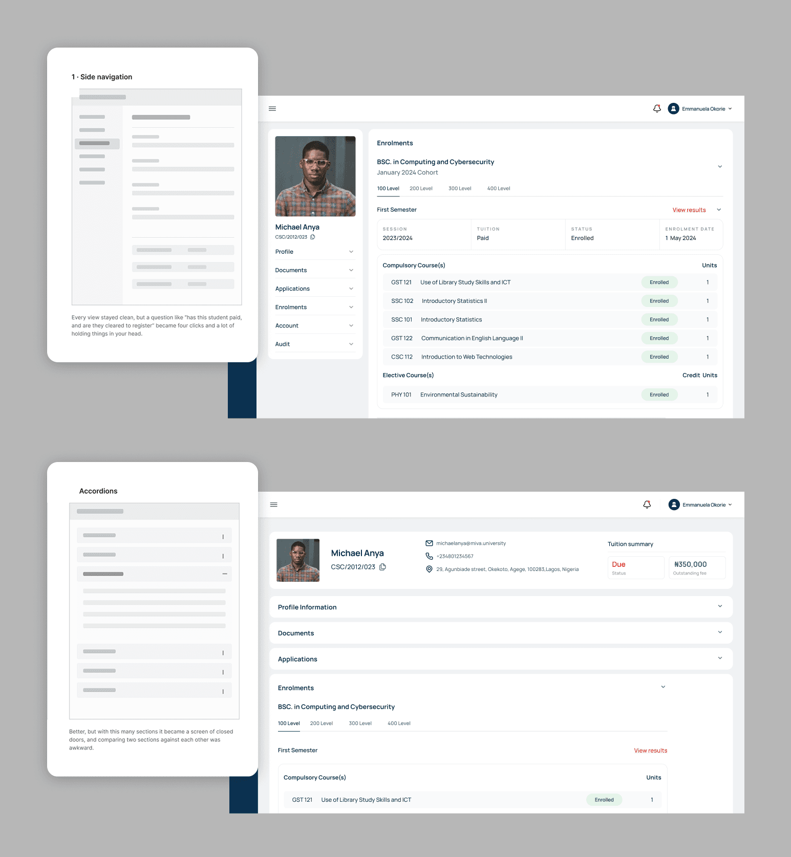
What shipped was a fixed block at the top carrying the details an admin always needs, with a tabbed section beneath it for everything else. The persistent block meant the answer to "who is this and where do they stand" never left the screen no matter which tab was open, and the tabs let each section be legible on its own terms.

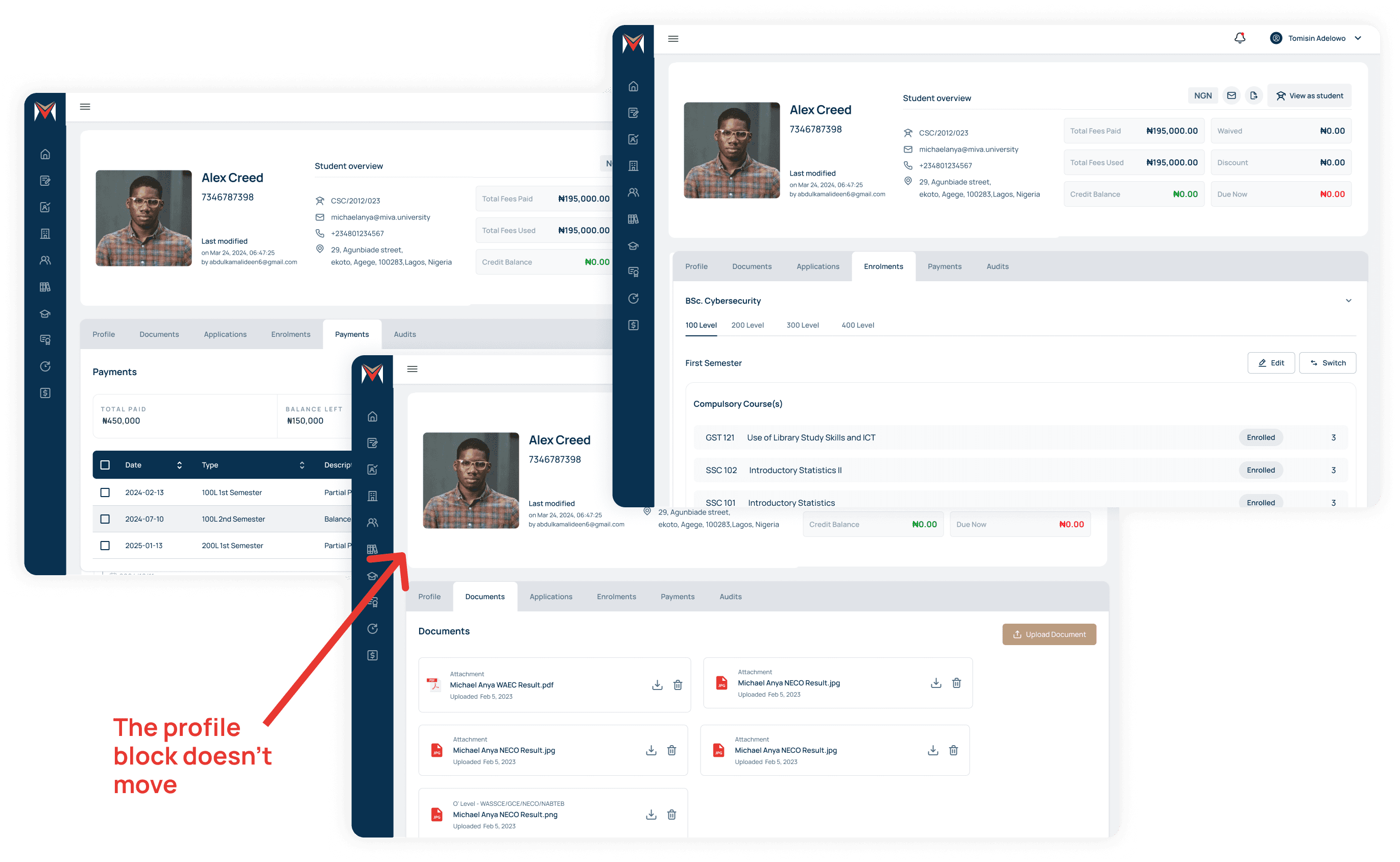
The audit trail sits in there too, which is less common on a student profile. It covers both sides. Student actions like registrations, enrolments and emails sent, and admin actions, so it's possible to see who changed what and when.

Access Decided The Architecture
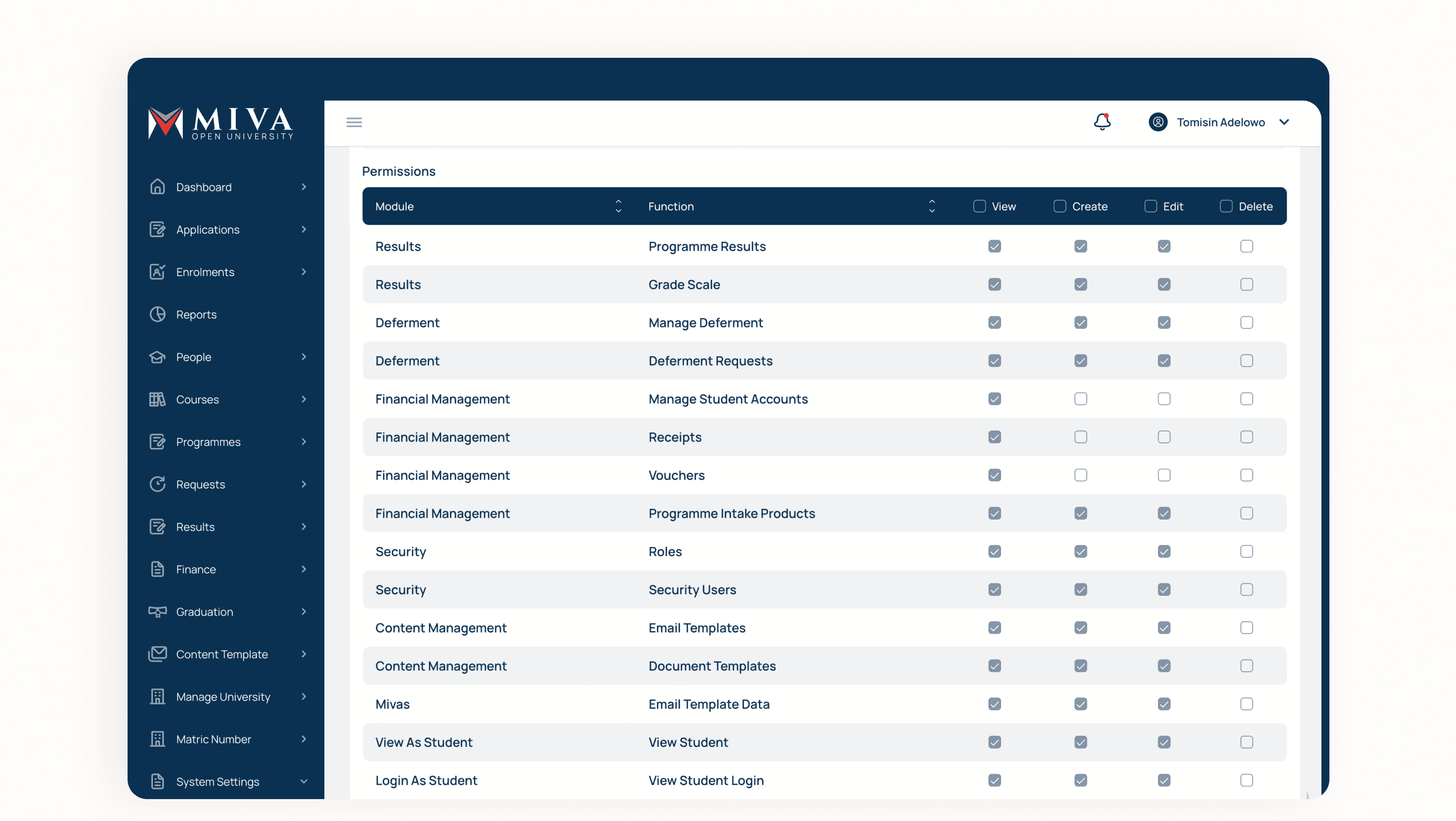
The SIS holds money, grades and personal records for 30,000+ people, and a lot of different admin roles touch the same student. Deciding who can do what was not a settings screen we added at the end. It shaped where things live.
Access works at two levels. The first is the module. A role either holds it or it does not, so the navigation is the boundary, and someone without Financial Management never sees Financial Management.
The second is the action, and that is where most of the thinking went.
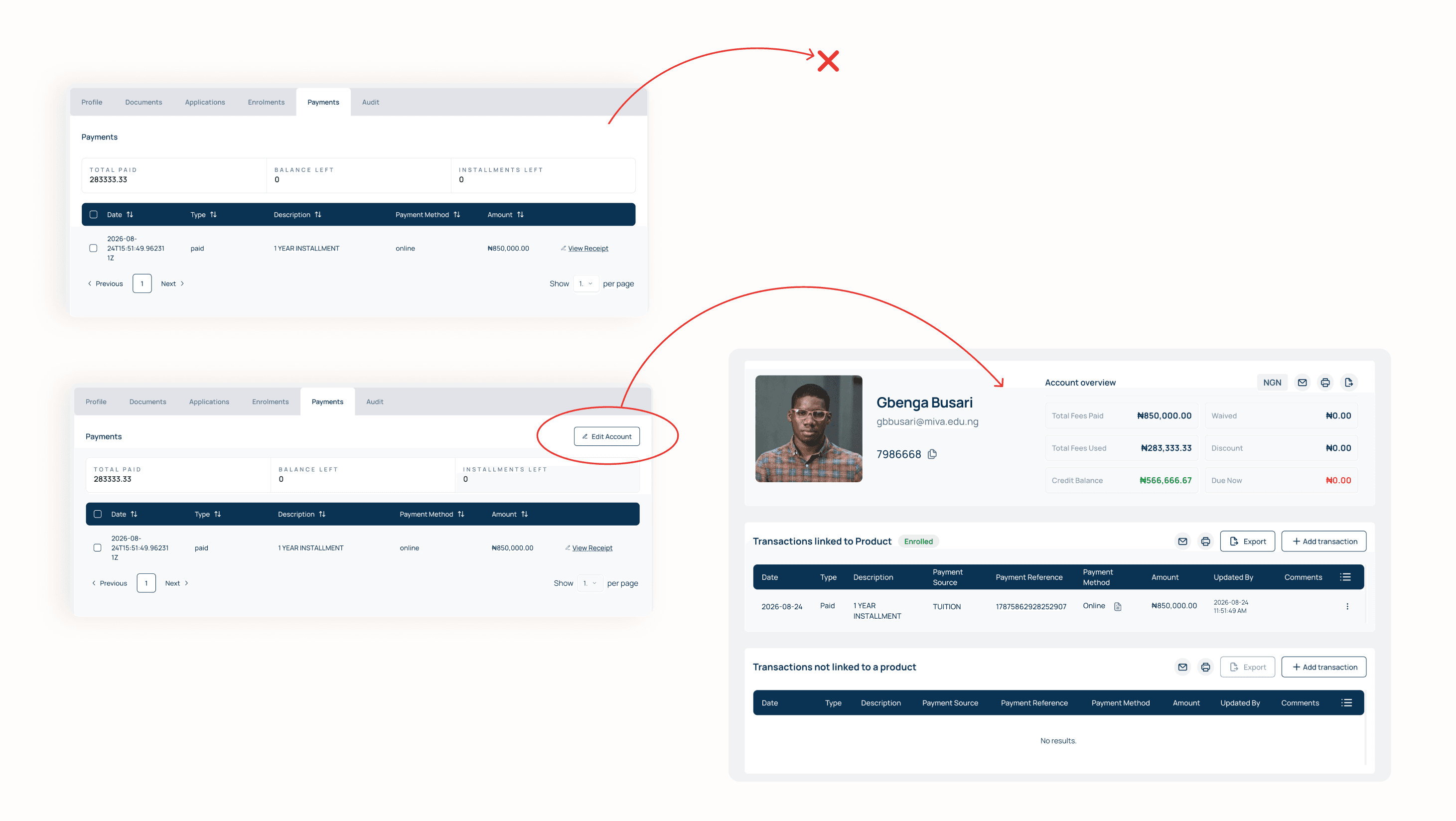
Permissions are enforced by what is on the page, not by disabling what is on it. A role that can see a student's payment position but has no authority to change it does not see a greyed out field. The value simply is not editable there. Editing lives behind an action, and the action is what role based access control gates. The same applies to contact details, programme changes and anything else where seeing and changing are different privileges.
Applying a payment works the same way. It is reachable from the profile but opens a separate, targeted financial view. Partly that is about room, since those actions need context the profile cannot spare. Mostly it is about who is allowed to move money. Access to a student's profile is common across admin roles. Authority over their balance is not.
Designed for Scanning, not Reading
Admins don't read tables, they scan them. They are looking down a column for an amount that looks wrong, or across a set of rows for the student whose status differs from everyone else's. Almost every decision we made about tables comes back to that.
The rule we settled on is that operational data survives and descriptive data gives way. IDs, statuses, dates and amounts are never truncated, because those are the things being compared. Descriptive content is truncated where it has to be. Key columns hold consistent widths so a column of amounts or dates lines up and scans vertically, and rows can run to multiple lines where the extra context genuinely earns it.
Record names are text links through to the record itself, so a row is both something to scan and a way in.
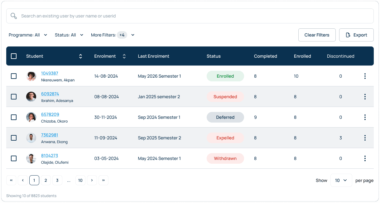
Key columns have consistent widths so a column of amounts or dates scans vertically. Where extra context genuinely helps, rows can run to multiple lines. On wider tables we scroll horizontally and freeze the leftmost columns, so you never lose track of which student a row belongs to while reading across.
Rows are selected with checkboxes and the bulk action menu appears only once something is selected, which keeps the default view quiet. Filters, sort and search are always available. Status is carried by pills so it reads without a legend, and everything secondary sits behind an overflow menu rather than competing for column space.
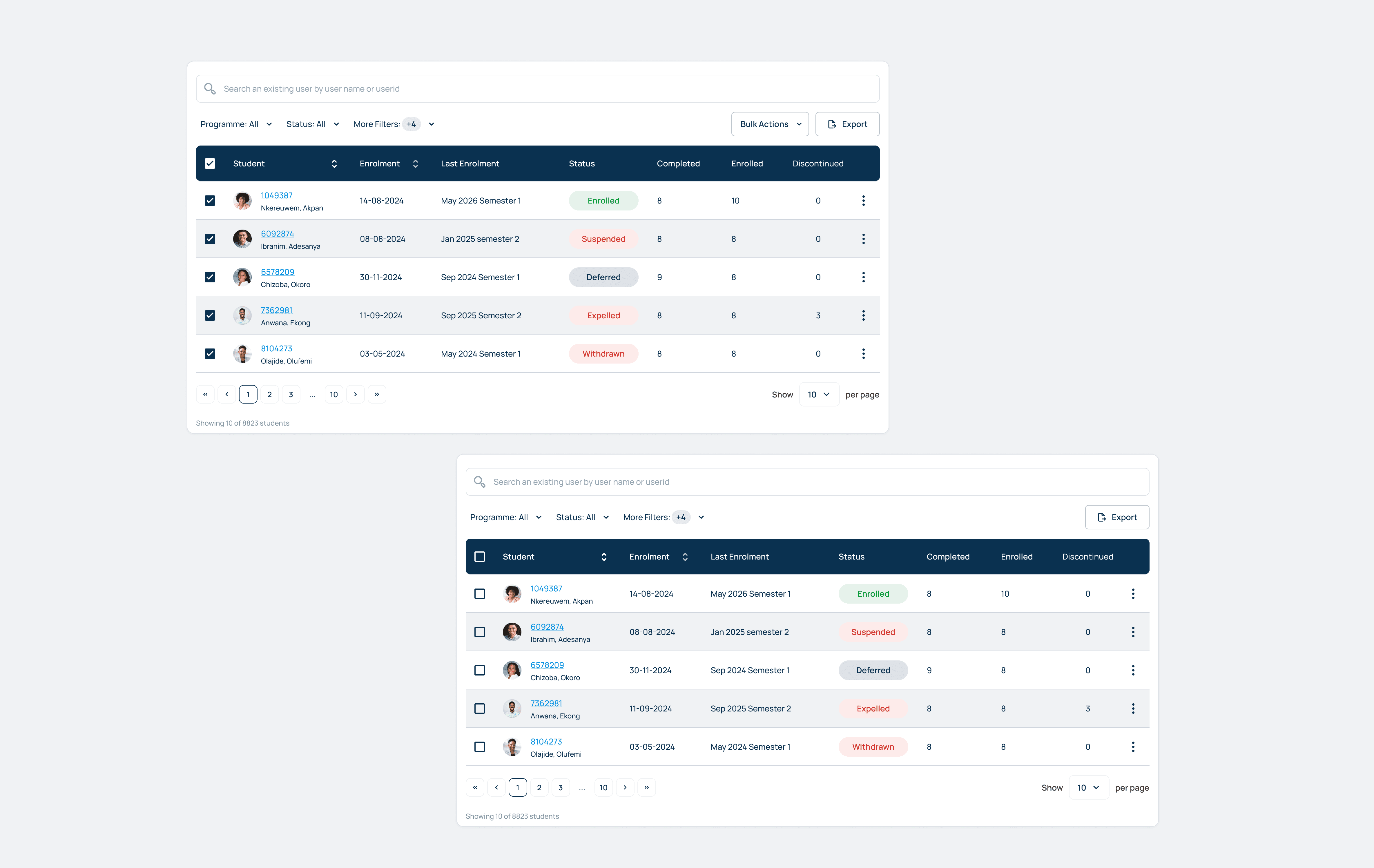
We paginated rather than scrolling infinitely. With more than 30,000 student records, pagination gave us predictable performance, and it gave admins something infinite scroll takes away, which is a sense of how much there is and where they are in it. Admins can set how many rows they want per page.
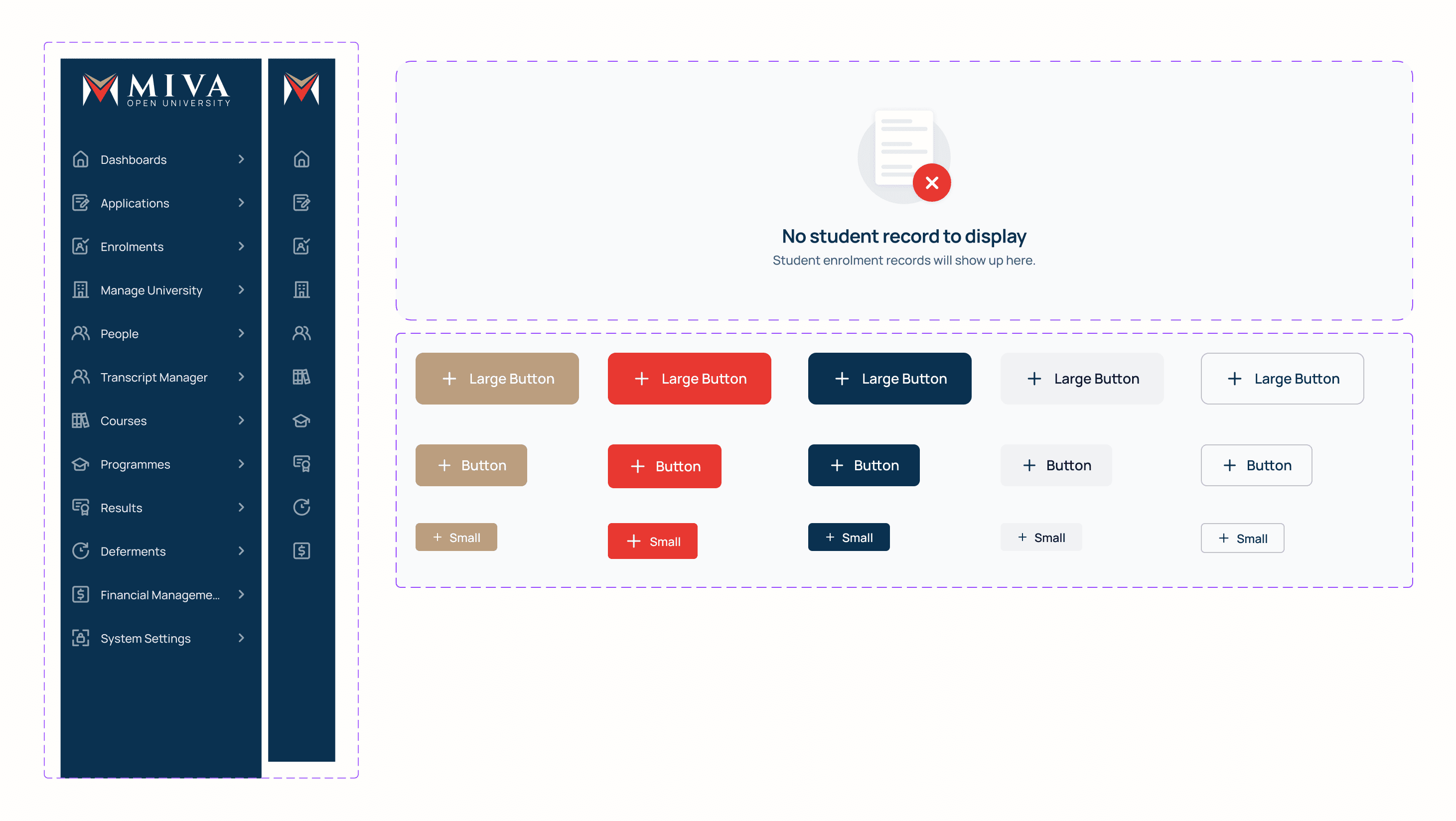
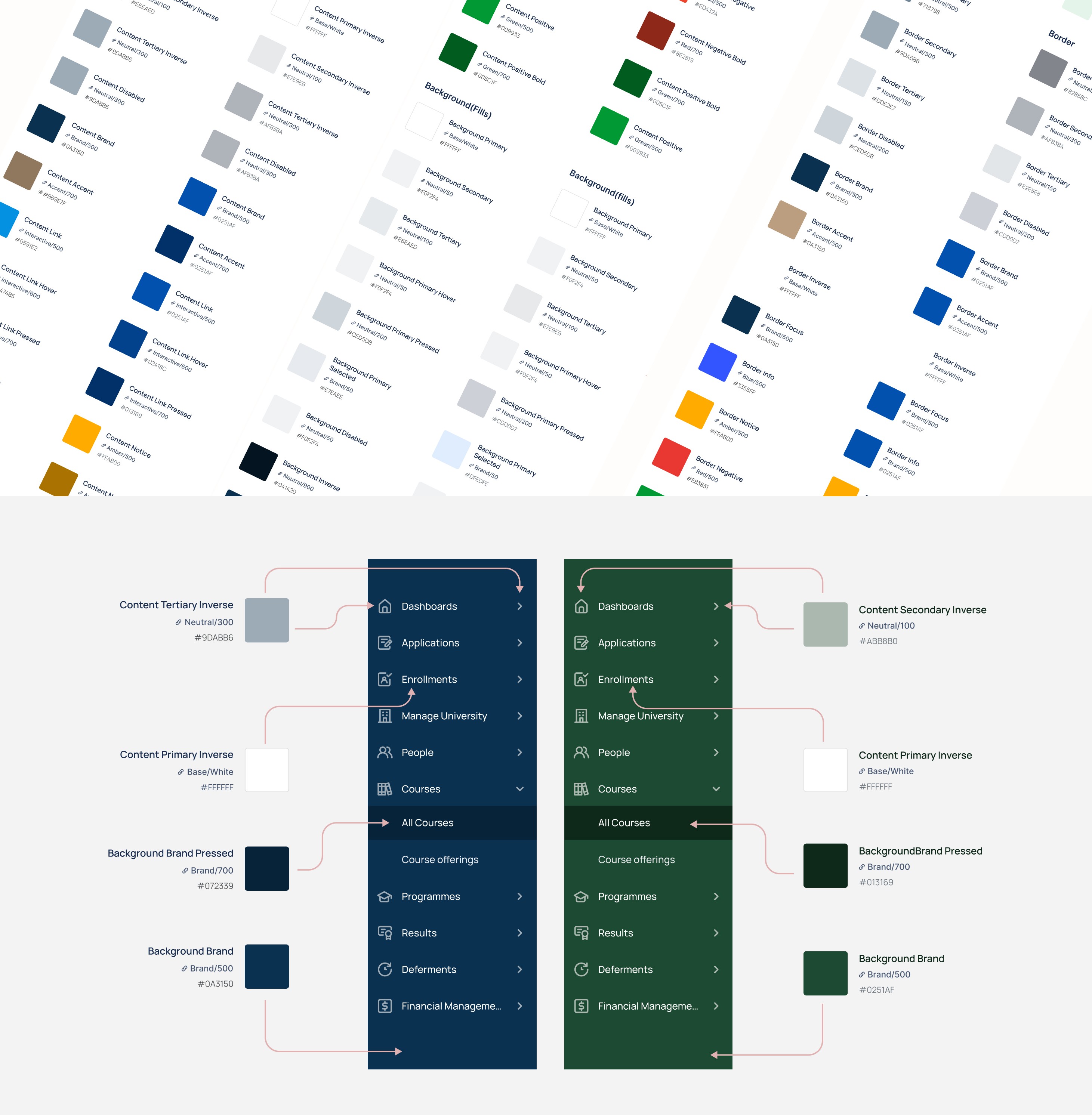
Underneath all of this is a component library of tables, fields, buttons, checkboxes and the rest, built on variables rather than fixed styles. Table density switches between dense and compact depending on the context the table sits in. The sidebar switches between expanded and collapsed. Every data surface carries its default, empty, loading and error states as part of the component rather than as something added later.
The SIS was also built to run for more than one institution, so the tokens were made to be reconfigured rather than rewritten. This way another institution can launch on the same system and be configured rather than rebuilt.

What changed after launch
The first thing we learned came out of the migration data. When legacy balances came across they were irregular, with odd amounts, partial payments and sums that matched no instalment we had defined. Because our instalment structure was fixed, the system had no way to accept them. Students with an outstanding balance could not pay it off, which meant they could not enrol in a new semester, which meant they could not sit exams. Between the migration data and the issues students were reporting, it was clear the structure was the problem rather than the students.
Our first response was a flow that surfaced a student's previous outstanding balances and linked them directly to the payment gateway, so they could clear what they owed and move on. It worked, but it was a data collation fix. It corrected the records and left the underlying problem in place.
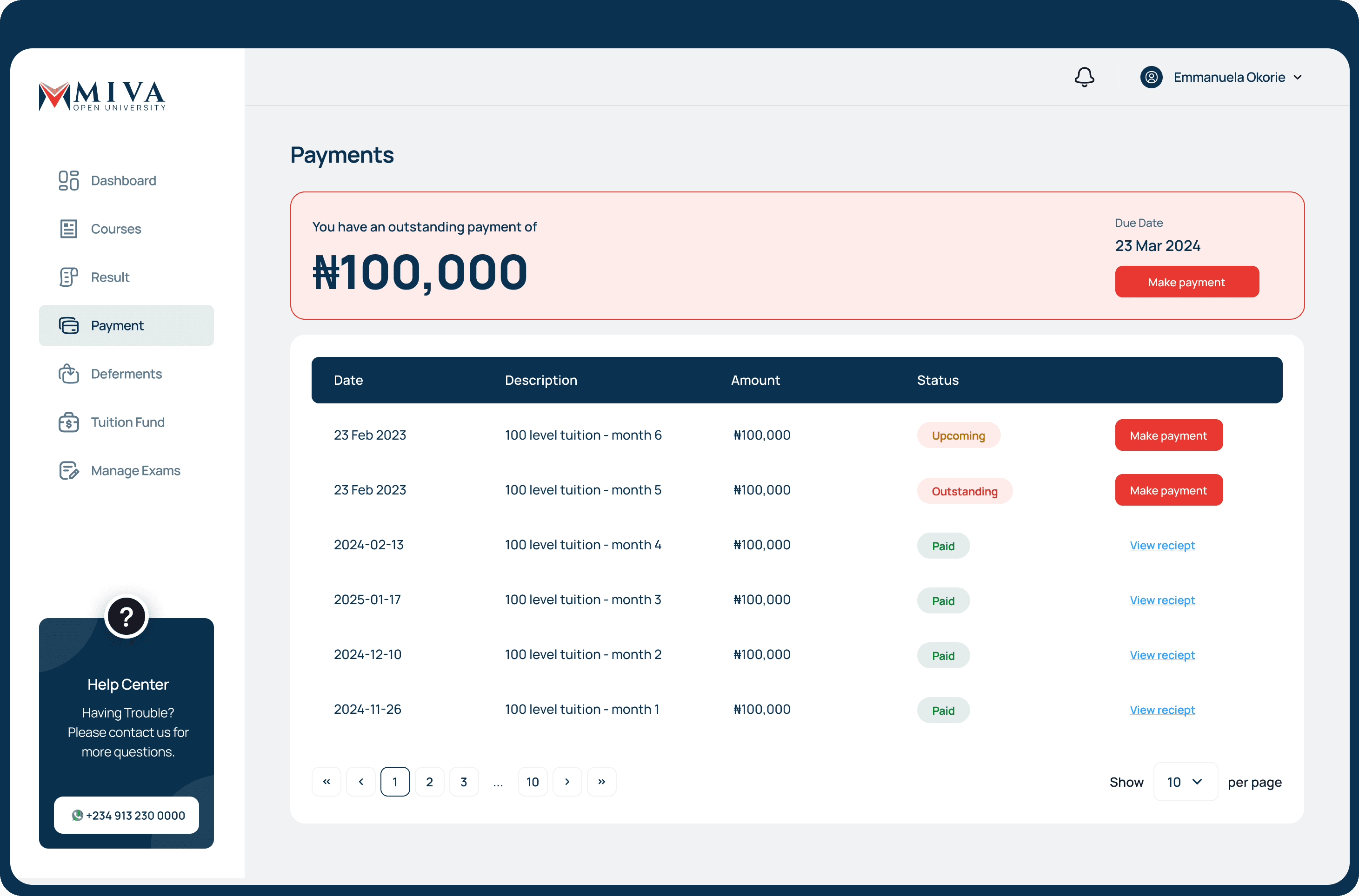
Tuition needed to be paid in full and up front so revenue could be reconciled against the right term, and deferment was making that impossible. A student could defer at any point and their payment carried with them, so a term's revenue was never settled. We closed the deferment window at enrolment, and moved payment to before enrolment rather than after.
Both of those made the system stricter for students, and stricter is a problem when income is irregular. What students needed was to be able to put in the little they had, when they had it, and still meet a deadline they now could not miss.
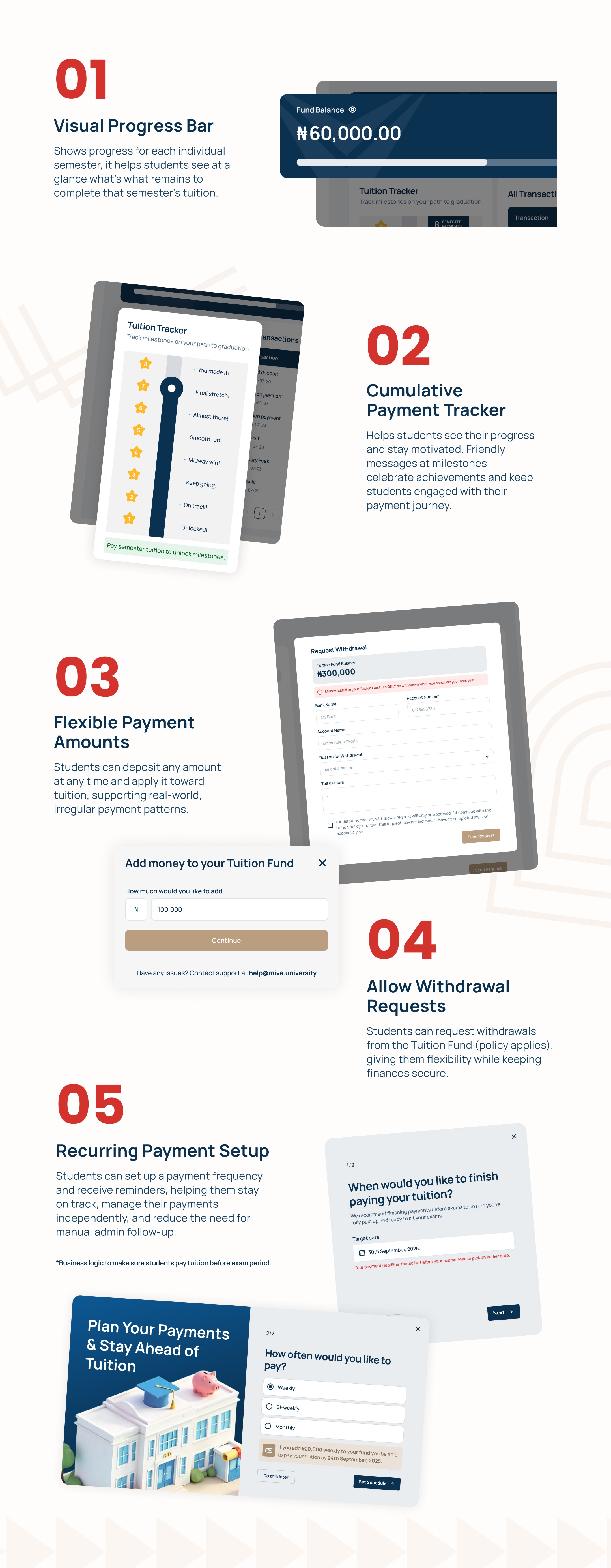
This led to the introduction of a new way to make flexible payments through a "Tuition Fund". The fund behaves like a recurring savings wallet. A student can set a schedule to contribute at regular intervals, or deposit whatever they have whenever they have it, and money in the fund is ringfenced for tuition. The goal is to reach the amount for the next semester before it starts, or for a full session, and a progress bar tracks them against it.

The fund does not apply itself. When a student reaches their target they decide when to use it, and that was deliberate. Many of our students are working professionals who pause their studies and resume when they can. Auto-applying would force both a payment and a course enrolment at a moment they had not chosen, and hitting a savings target is not the same as being ready to start a semester. Paying and enrolling are two separate decisions. So we allow student to pay tuition and enrol at a time of their choosing.
Pausing and resuming is the same reality the fund was built around, and it shows up in the academic record as well as the money. Students raise deferment requests themselves through their portal, choosing what they want to defer and when they want to return.
Every request arrives in one admin view with the student, programme, request type and advisor already attached, so there is nothing to look up before deciding. Approve, reject and follow up sit on the request itself. Enrolment records open inside the request, so an admin executing a deferment or resumption never leaves the screen to do it. And every action confirms in both directions, with the admin shown what will happen and the student told what did

Challenges
The legacy data did not fit the new model. Student records, historical payments and course enrolments had been maintained across systems that never agreed with each other, so much of it arrived in shapes the new structure had no place for. Mis-enrolments already existed in the old data and had to be cleaned before anything could be brought across. Payment records were worse. Because payments had been tracked in spreadsheets rather than held in a system, several were missing entirely, and establishing what a student had actually paid meant going through sheets by hand.
The problem that outlasted the cleanup was a single field.
When an admin enrols a student, they select the academic time period it belongs to. A cohort, and a semester within it. It looks like an ordinary dropdown, and it carries three consequences. Tuition is priced per cohort, so the wrong selection charges the student the wrong amount. The LMS groups students by whatever cohort the SIS holds, so the wrong selection can cut a student off from their own assessments. And correcting either afterwards is manual work.
Records came across from the migration with the wrong period attached. Students who began on the new system were unaffected, so the problem was the legacy data rather than the platform, but that was no comfort to the people it happened to.
Our first response was a process one. We wrote an enrolment manual covering the naming rules, the exceptions and a step by step procedure ending in manual verification, then trained admins on it. It reduced the errors, and it put the control in the wrong place. We had built a screen where the most consequential decision on it was a free selection, and then asked people to be careful.
We could not simply derive the value. A deferred student legitimately moves to a different cohort, so this has to stay a decision someone makes. It did not have to stay an unguarded one.
So the list now shows only the academic periods active at that point, which means most wrong answers are never offered. If a selection differs from the cohort the student is already in, the interface says so before accepting it, because that case is real but rare and worth a pause. And the fee attached to the selection appears while it is being chosen, so the financial consequence is visible during the decision instead of afterwards as a balance.
Outcomes & Impact
|
What I'd do differently
We migrated everyone at once, and we checked the wrong thing.
The deadline was fixed. The academic calendar does not move, and we were building against it, so we cut the whole institution over in one go. Our checks confirmed that records had come across rather than that they had come across correctly, and a row count that matches tells you nothing about whether the academic time period attached to each enrolment is the right one. That was the thing that broke.
I would migrate a subset first. One cohort, verified field by field, before the rest followed. The problem would have surfaced on a few hundred records instead of on thousands, and it would have surfaced to us rather than to students.
We wrote the manual before we built the guard.
When the mis-enrolments appeared, our first response was documentation and training. The interface changes that made the mistake hard to make came afterwards. That order was backwards. Training is what you reach for when you cannot change the system, and we could change the system.

