

Overview
I designed a mobile-first web app for giving away and selling my personal things to friends, and modelled the whole interaction on a dating app (swipe right to claim). Watching real people use it, the swipe was quietly breaking the core task: they wanted to browse through what was available, compare items, and change their minds, and the one-card-at-a-time deck fought all three. So I redesigned it around a browsable cards where every decision lives on the card and nothing is final. Around 15 friends used it, and 57 things found new homes.
Role, team, timeline
I designed and built the product as a solo project over a few evenings, taking it from the first interaction concept through testing, redesign and launch with a small group of friends.
The Problem
I had a handful of things I wanted to rehome. Some I was happy to give away, others I wanted to sell, and I wanted them to go to people I knew.
The obvious place to share them was a group chat, but group chats get messy fast. Photos disappear into the conversation, multiple people ask for the same item, and it quickly becomes difficult to track who wants what, what is still available, and who should get it.
Posting everything publicly didn’t feel right either. I didn’t want my entire feed seeing what I was moving on, and while I could have used a marketplace or decluttering service, I preferred to keep it within a smaller circle of friends.
So the problem became: how might I make it easy for friends to see what’s available, express interest, and let me decide who gets each item without turning the experience into an online shop?
That meant keeping the product deliberately simple: no sign-up, no payment gateway, no checkout. I just needed to see who wanted what and decide who got it.
The first direction, and why it looked right
Rehoming a bunch of things can quickly feel like a chore, so I wanted the interaction to feel lighter and a little more playful.
The first version was a swipe deck (dating app style). One item at a time. Swipe right if you wanted it, left to pass, and up for “I need this.” Cards tilted as you dragged, haptics fired on every swipe, and confetti appeared when you claimed something. If you swiped by mistake, a Rewind button let you undo it. There was even a heart button for items you really liked.
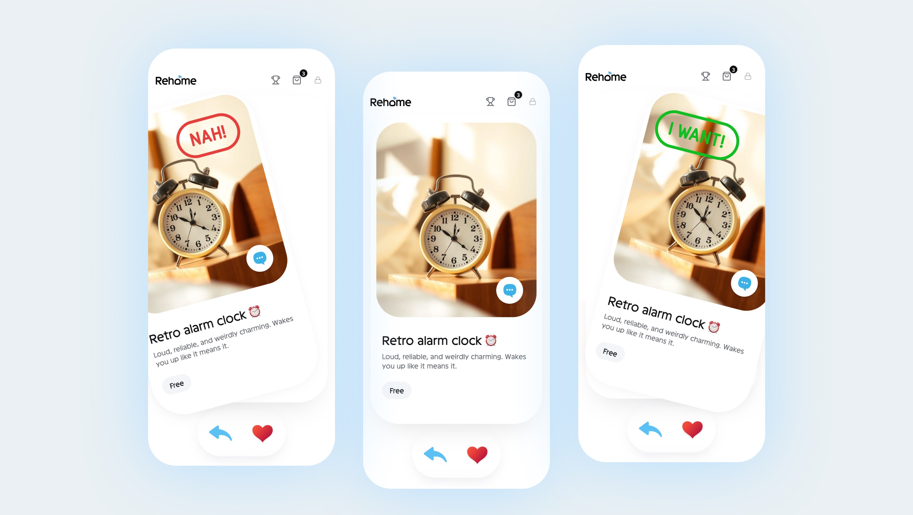
The first draft looked and felt great. Everything worked exactly as I had imagined it.
I now treat that as proof of a good implementation, not necessarily a good product. A satisfying prototype and a usable experience are two different things. The gap between them usually shows up in the first few minutes of real use.
Testing the first version
Once I had a first draft, I shared it with two friends and watched them use it. Almost everything that tripped them up traced back to one place, and it wasn’t where I expected.
First interaction model
First, the icons didn’t say what I thought they said.
I had a heart and a separate “I need it” swipe action. But was the heart a "like", or did it mean “I want this”? And how was needing something meaningfully different from wanting it? The distinction made sense in my head, but not on the screen.
The rewind action was even harder to read. Was it undo, or back to last item?
When swiping, were you navigating through the deck or making a decision about the item?

This was when I realised the core gesture itself was overloaded.
I had designed swipe as a way to dismiss a card, but people instinctively wanted to swipe through the collection. The same motion was being asked to mean two different things.
That created even more questions. Does a swiped card disappear for good or move to the back? If you return later, do you see everything again or only what you haven’t acted on? Does the card fly off-screen or tuck behind the others? And what order should the cards appear in?
The underlying issue
Underneath all of those interaction problems was a behaviour I had designed straight past.
People wanted to compare things before deciding.
They moved back and forth between items a lot more than I expected. A chair might look better after seeing the lamp. Something they skipped at first could suddenly feel like the better option once they had seen everything else.
They changed their minds. A lot.
“Actually, not the lamp. The chair.”
The swipe model treated every decision like it was final, but that wasn’t how people were choosing. They wanted to look around, come back, reconsider, and then decide.
Once something disappeared, it was hard to keep track of.
If a card left the stack, people couldn’t easily go back to it, check if it was still available, or even remember what they had already seen. That was the point where it clicked for me. The icons weren’t really the problem. The one-card-at-a-time format wasn’t the problem either.
The problem was that I had made browsing and deciding the same thing. So I separated them.

Redesigning the interaction
Once I realised browsing and deciding needed to be separate, the interaction got much simpler.
I kept the one-card-at-a-time format because I still liked the focus it gave each item. What changed was how you moved through them.
Swiping was no longer a decision. You could swipe or use the arrows to move forward and back, revisit something you had seen earlier, and change your mind as often as you wanted.
Then I made the decision explicit. Tapping the heart now meant one thing: I want this, and the card immediately received the “I want it” stamp. Passing was separate, and moving between items no longer made either decision for you.
It sounds like a small change, but it fixed most of what had felt awkward in the first version.
Browse however you want. Decide when you’re ready.

Keeping the playfulness
I didn’t want fixing the interaction to strip out everything that made the first version fun.
Some of those ideas still had a place. The stamps became a simple way to show an item’s status, like “I want it,” “I’ll pass,” “It’s yours,” or “Out of stock.”
Confetti stayed too, but only for moments that actually felt worth celebrating, like being the first person to want an item or finding out it was yours.
I also kept the small one-line backstories on some items. They weren’t necessary to complete the task, but they made the collection feel more personal and gave people a little something to discover as they browsed.
The difference was that none of these things had to carry the interaction anymore. Browsing and deciding were clear on their own.
The delight became flavour, not structure.
Small details that mattered
Once the main interaction worked, a lot of the design came down to smaller details.
Keeping status visible.
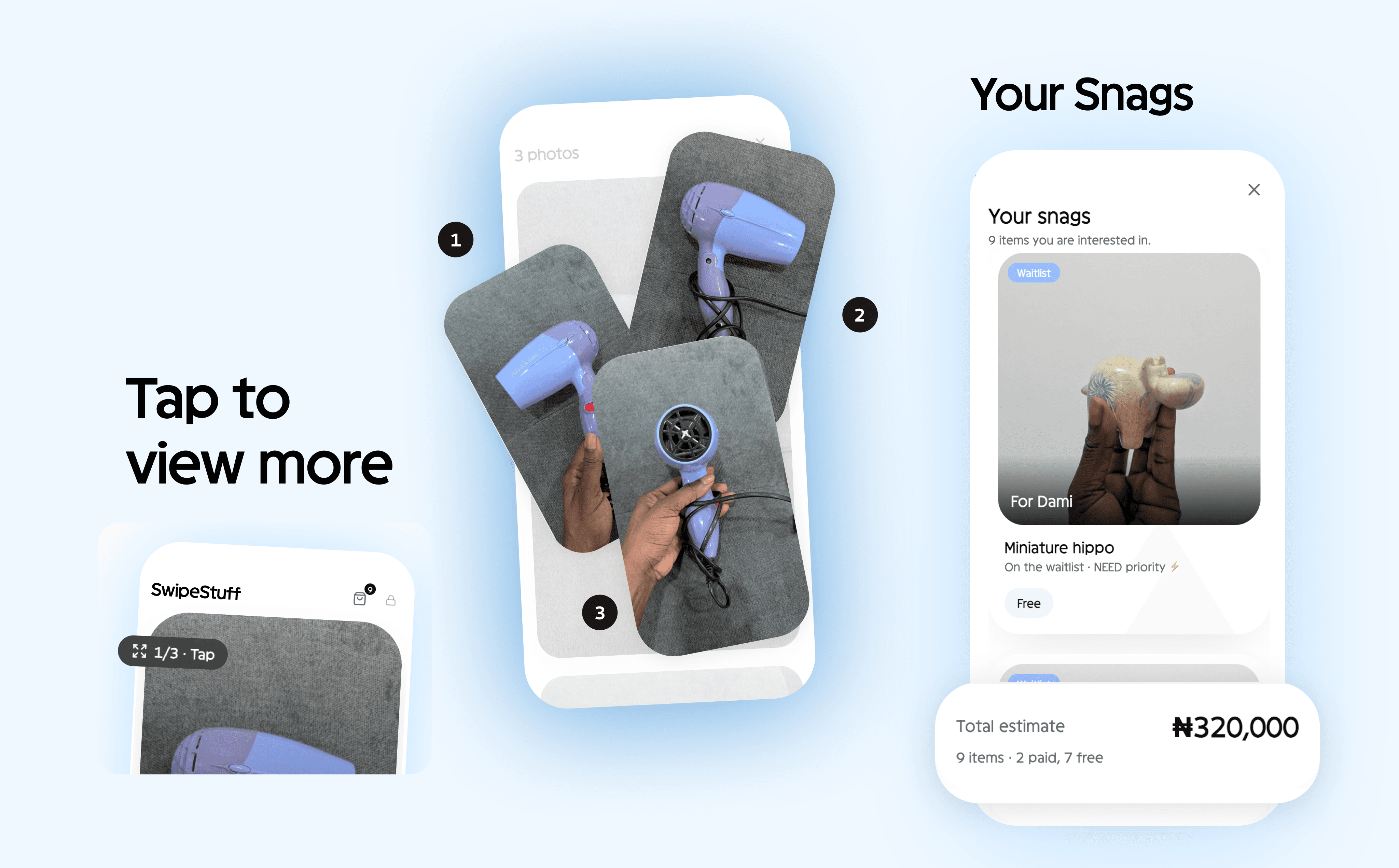
You shouldn’t have to remember what you did with an item. Its status stayed on the card, so you could immediately tell whether you wanted it, passed on it, got it, or it was no longer available.
Keeping selected items together.
People could open a single view of everything they had wanted so far, rather than trying to remember each item as they browsed. For priced items, I also showed the combined total, so they could quickly see what they had selected and what it would cost altogether.
Making more photos obvious.
Some things needed more than one picture. A single image gave no indication there was anything else to see, so I added a photo count and a clear tap cue. You could tell at a glance that there were more angles without having to discover them by accident.
Designing the owner side
The friend experience was deliberately simple, but the owner side had to handle everything happening behind it.
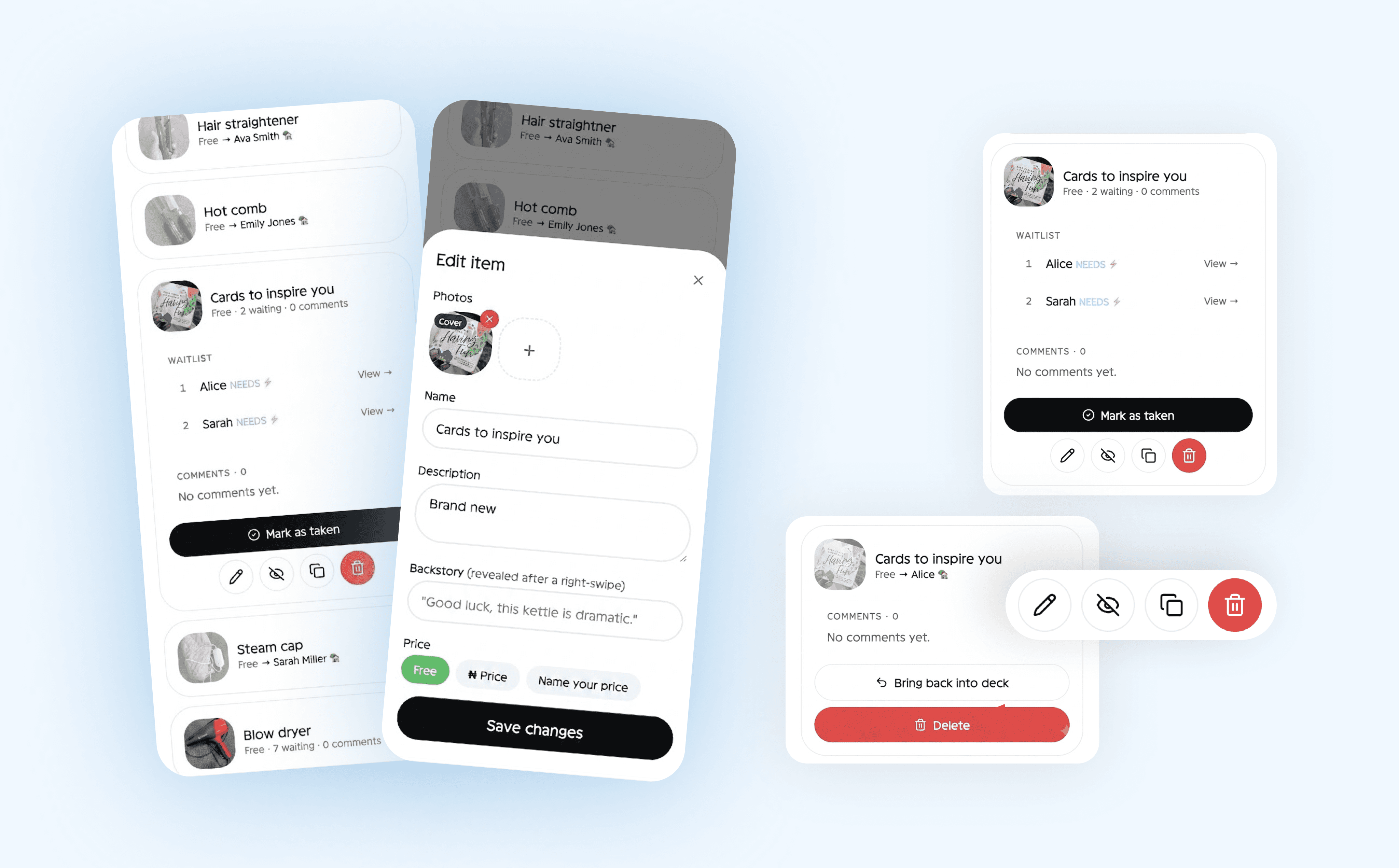
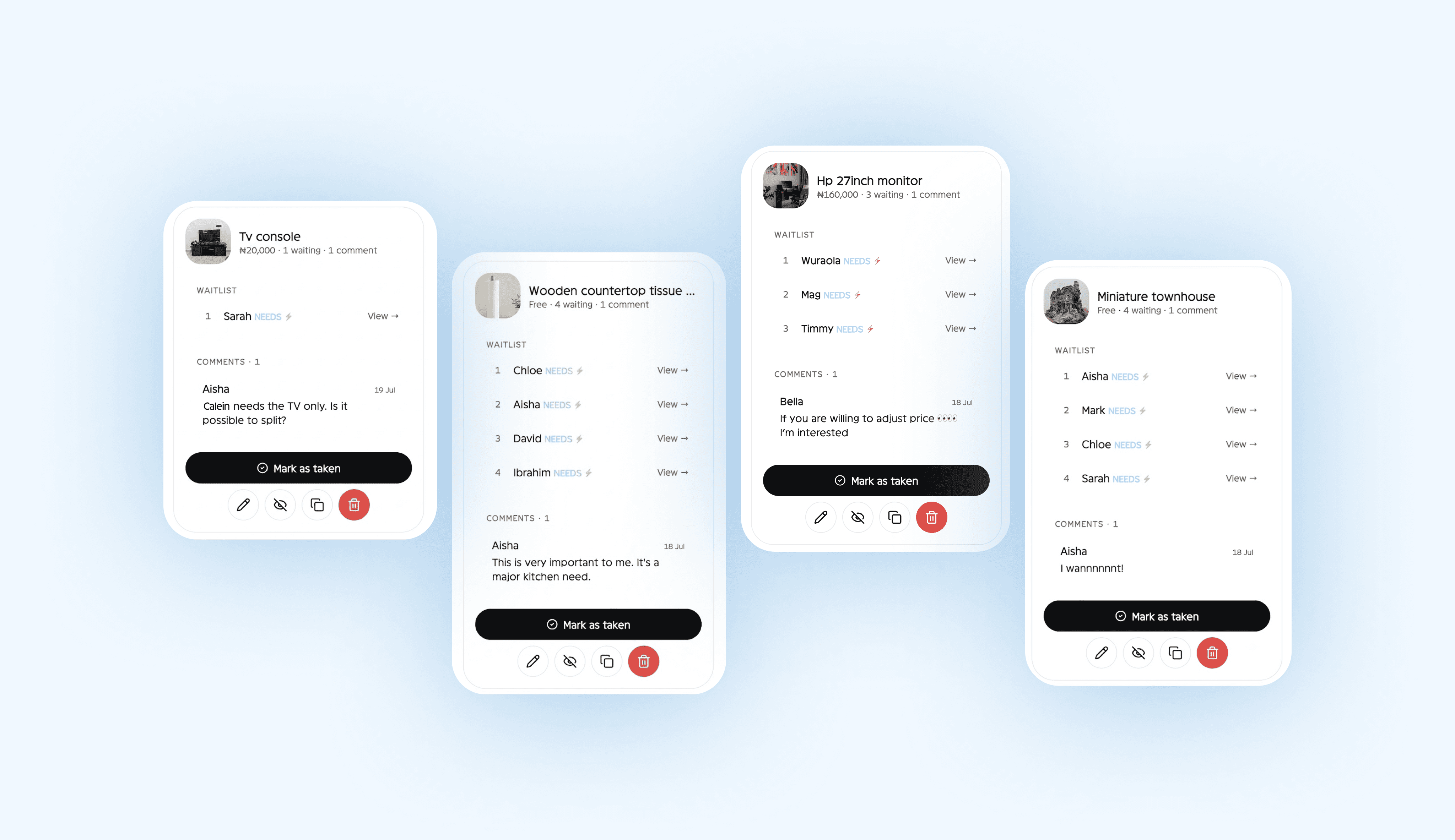
The first thing I needed was visibility. Some items had several people interested in them, so I could see who wanted what, filter by demand, and decide who got each item. I deliberately didn’t make it first-come-first-served. The product was there to help me make the decision, not make it for me.
Those decisions also needed to be reversible. Plans changed offline, people changed their minds, and sometimes I changed mine. I could remove someone from a waitlist, bring an item back, mark it as taken, or hide and unhide something without deleting it.
There were a few practical controls too. I could duplicate an item if I had more than one, and hide things I wasn’t ready to share yet.

Not everything fit neatly into “want” or “pass” either.
Friends wanted to ask things like “is this still good?”, “can you hold it for me?”, or just leave a bit of banter. So each item got comments, giving people somewhere for the conversations the main actions couldn’t carry.
I also spent time on what happened after I chose who got something, because matching someone to an item wasn’t the end of the job.
I could export all of a friend’s items into one shareable image, essentially a simple “here’s what you’re getting.” From there, the product stepped aside. Pickup, payment and everything else happened on WhatsApp. Those were conversations between friends, not workflows I needed to build.
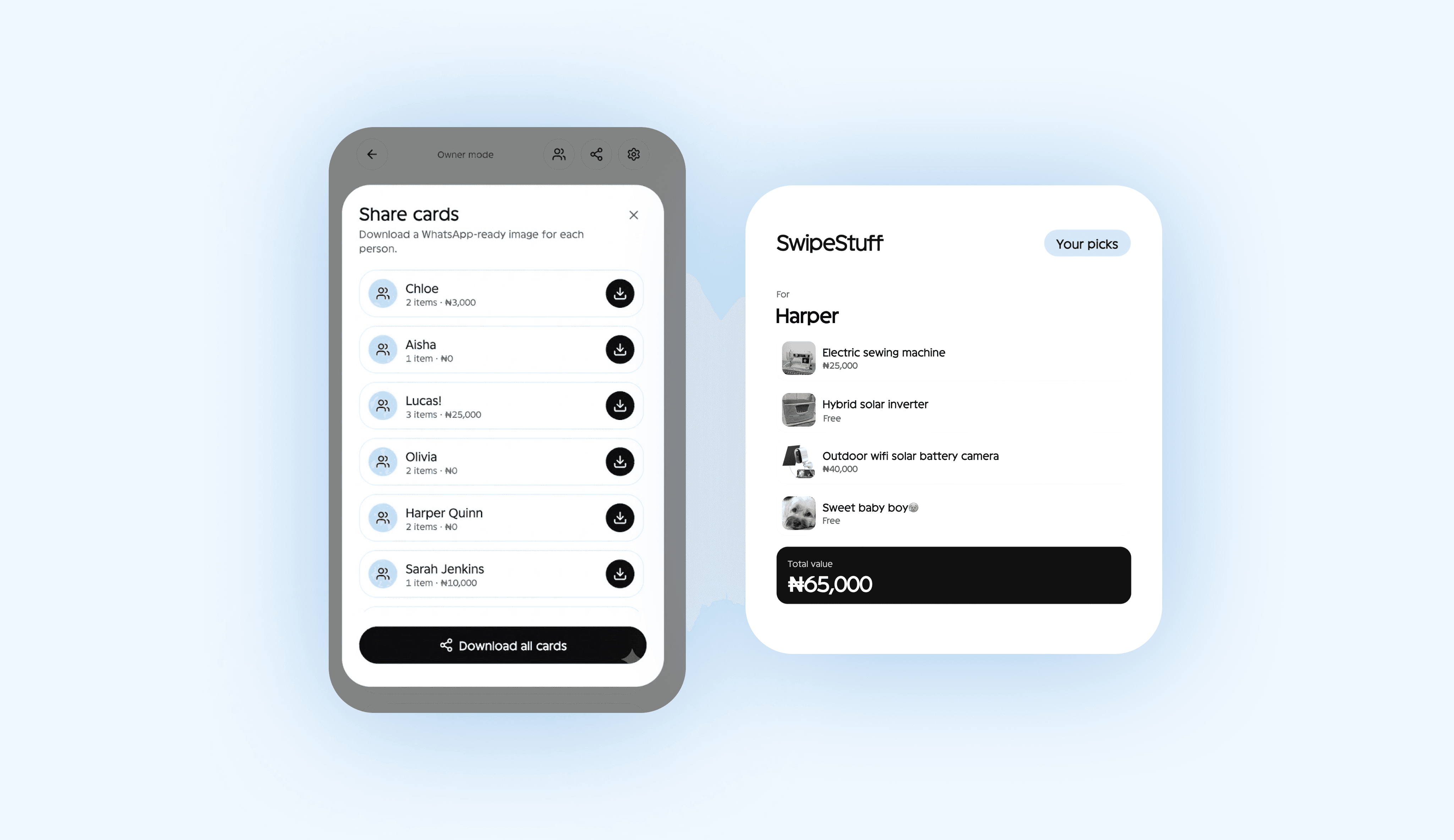
Pricing stayed flexible too. An item could be free, have a fixed price, or let someone name their price.
And access stayed deliberately lightweight. Everyone used the same link, with no accounts to create. A friend only added their name the first time they wanted something, while I accessed the owner side through the same link behind a passcode.
The whole thing could still be shared with a URL.
What happened when I shipped it
This wasn’t a concept I mocked up and left in Figma. I built it in Lovable over a few evenings, shared the link with my friends, and let it run.
Around fifteen people used it. I listed 67 items, and 57 found a new home, with 10 still left when I last counted.
More useful than the numbers was seeing what happened once people actually used it. Friends compared things, changed their minds, competed for the same items, asked questions and sorted out pickup or payment outside the product. A lot of the final design came from watching those behaviours rather than trying to predict all of them upfront.
It also exposed one trade-off I would revisit.
The no-sign-up approach worked well for something this small. A friend could open the link and start browsing without creating an account. But once their browser session ended, there was no reliable way for them to come back and see everything they had selected.
In practice, I ended up sending people a summary of what they were getting.
That was fine for this version, but it wouldn’t hold up if this became a full product. I’d want some lightweight way to recognise returning users and recover their selections without immediately turning the experience into another account and password flow.
So I’d keep the low-friction access, but rethink the lack of persistence.
What I took from it
The biggest lesson wasn’t that swipe interactions are bad. It was that I had given swipe the wrong job.
The first version looked good and felt satisfying, but a few minutes of watching people use it showed that the interaction didn’t match how they were actually making decisions. They browsed, compared, went back and changed their minds.
So I changed the interaction instead of trying to make their behaviour fit it.
A few things from this project will stick with me.
Design for the behaviour underneath the interface.
A polished interaction can still be the wrong model. Once I separated browsing from deciding, most of the friction disappeared.
Use constraints to keep the product focused.
I kept coming back to one question: does this still feel like something between friends, or am I accidentally building a marketplace? That made it easier to leave out payments, delivery and other features that would have added complexity without solving the problem I started with.
Delight works better when it isn’t doing the heavy lifting.
The stamps, confetti, and playful copy all survived the redesign. They just stopped being responsible for making the interaction understandable.


